Final Identity
Posted by tash12larsen on Jan 31, 2015 in Blog, Identity, Portfolio
Personal Logos
There was a lot I discovered about myself while I was researching. People describe me with specific words because of what I have gone through in my life. I tried to incorporate those words into my designs. I have three logos that I have created to represent me. Some of them just words and others having vectors to go along with it. These logos I will be able to incorporate into my own photography business so that I can establish a brand for myself.
First Design
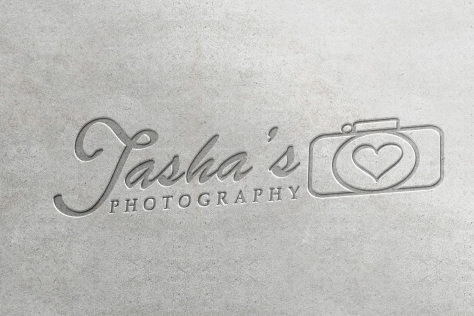
The first logo has a heart because I thought the heart was a good symbol for who I was. I am a very loving and compassionate person and I wanted to try and show that in one of my logos. I wanted my name to stand out and because there was already the camera graphic that was showing what I do but I want people to remember my name.
Second Design
The second design is very simple and doesn’t have a lot of fluff. I like sticking to the point and getting stuff done and this logo can show you some of that. I love the color blue so I also wanted to incorporate that into my logos somewhere. I figured I could use the initial logo as a watermark on photos that could be tied to the bottom logo with the blue camera.
Third Design
The bottom logo was my favorite from the very beginning I knew exactly what I wanted and I got it done. I love this logo because I feel like it shows me as a person pretty well. I’m one who likes to have fun and go with the flow and take pictures what more would you need in a logo about photography.
Favorite Logo
As I continued to work on my logos I decided that the last one I did was actually my favorite. It was the one I started from scratch and threw together. I liked it the most out of all of them. I was able to add some last minute details to it like the heart to show more about myself. It was hard working on a new logo because I had set a timeline and once I decided to do the new one the timeline kind of almost had to be changed and revised to work with the little time I had.
Challenges
As I was working on my logos in illustrator I started to realize that I didn’t know the program as well as I would like to know it. I would get an idea in my head of something I would want to do, but then I would go to do it and it wouldn’t work for me. I would get really frustrated then just give up. In the future I need to stick with what I want to do and work on it. Although I struggle a bit I was able to overcome some of my challenges by asking for help and talking to my father-in-law about logos or looking up on Google how to do specific things.
Mockup
For my last part of the assignment I was able to use a Mockup to make my logo look like it was professionally done. I hope you enjoyed my logo designs and continue to check back for more projects that I will do for this semester.
Share


